A couple of days ago, we told you that we had a new look in the works. After a lot of consideration, we wanted to foster NoWhiteNoise into becoming an inclusive place for most, if not all of, television’s various conversations — and that’s why we have settled on the following look.
And we really hope you like it!
Here’s what’s new with the different look and feel:
When you arrive at the NWN homepage, you’re met with three featured articles on top. These are posts here on the site that we think you should be paying attention to, varying from feature content to advance reviews and so forth.
Below that, you’ll find that posts are separated into categories. Up first is Features. A feature is an article that’s created specifically for and by NWN — lists, opinions, interviews, speculation, and so on. You get the recent four headlines and an option to read more. Under features is Recaps & Reviews. It’s the same concept, except something is a bit different — you can toggle between “Recent,” “Popular,” and “Photo Recaps.” These choices are pretty self-explanatory: Recent gives you the latest recaps and reviews, popular gives you the most popular recaps and reviews this month, and since we know people like to get to photo recaps quickly, you can choose to view only photo recaps. Under that, you’ll find Summer Rewatch (for the summer, where we’re watching Buffy the Vampire Slayer and The O.C. as well as a few other series) and a miscellaneous option.
Of course, if you hate the new categorization, you can always just scroll below and get the classic blog view of posts. (Hey, we tried a million and two different color schemes to make it look nice. Tried being the keyword. Function over form, I guess.)
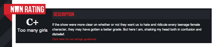
One of the most exciting (we’re easily excited) thing we’ve added is our new rating system, which is long overdue. Writers have the option to rate each and every episode with a letter grade from A through F, which is then displayed below their recap/review. Ratings also appear in the Recaps & Reviews section on the homepage and anywhere else around the site, like the Latest section.
Writers also have the option to use subtitles in their articles. These just help enhance what the article will be about, and seemed like a no brainer.
We haven’t added images to all of our show pages; we’re progressing slowly…but surely. Hopefully in the future, we can flesh out each page a bit more with series information, and so on. For now, you’ll just find a fancy image and the latest posts below.
Also, perhaps someday when we produce a lot of content, we can categorize these pages as well. Who knows!?
Up above, next to the logo, you’ll see a Trending section. This is just a list of shows we’re posting a lot about recently.
And that seems to wrap it up! I hope you like the new look. And if not, I’m sorry 🙁 But we’re still producing the same content (and even better stuff!) so 🙂
ABC's detective hit Moonlighting was one of the best TV show's of all time —…
Previously Published on Fan Fest News... For six seasons on The 100, actress Marie Avgeropoulos…
Previously Published on Fan Fest News... It seems The 100 fans have gotten their own…
I was browsing Reddit after the clock struck midnight on New Year's Eve (or what…
It's a little late, but I wanted to share a few shows I liked this…
Mark Hildreth is a jack of all trades, with an undeniable passion for entertaining. Viewers…
View Comments
I think you guys did a great job! Thanx for the update!
Thank you! Glad you like it :)
While I do not think that highly of the very idea of any sort of digitized rating system(because seriously, one can't just put 5+ paragraphs into a number or a letter), I generally LOVE the more sleek look of the website, even if the front page is a bit frightening at first and disorienting after the more "direct" previous one.
Also pages seem to load faster and take up less memory which is very very good.
The ratings was something the writers seemed quite enthusiastic about and, for the most part, is just commonplace. They're just there to offer a quick snapshot :)
About the front page, I was weary of it at first but in general I like it. I'll look into perhaps putting a toggle for categorized versus "direct", or maybe a link to jump to the direct view below. A lot of this is coding that's new to me so it can be haphazard.
But I'm glad you like the sleekness and the fastness!
Loving the new website, great job guys
Thank you! Really glad you like it!
How is The Glee Project trending?
It's a show we've been posting about lately (and it actually gets more traffic than other recaps).
I don't know how I feel about this. I like the rating system though!
:( but :)
I like the reorganization but I liked the old layout.
It looks great, very engaging. I like lots of content at your fingertips on the home screen, I find sites set up this way almost always offer something you want to take a quick look at. Congratulations! PS No white noise is a GREAT name IMO. Even with the digital wave, white noise is the background crap/noise of life haha. And a nice hark back to the roots of tv watching ('what's a rerun?' style).
Haven't stopped by in a while but I wanted to give you all some love for the great new look and add-ons!